in the mean time, i'm keeping myself busy reading all of your blogs and browsing the portfolios of some of my favorite designers and photographers. (it's 5 euros for 10 hours of wifi at starbucks in athens — thank god!) one such portfolio is that of photographer patric johansson, who photographed the following home for elle interiör a while back. the primarily black and white palette and the luxurious accents make this a beautiful space that i'm confident i could recreate on a budget. watch and learn...
the foundation is simple: white paint, one black accent wall, dark floors, and abundant natural light. the big furniture pieces can be found inexpensively, too.
how's this for a big black sofa? the proportions are great and the price can't be beat. a few throw pillows in the same palette and you'll be good to go!
for the coffee table, a wooden trunk is a must. i love this option (thank you, camila, for the link to this site!) but the price is still a little steep, even if it is a great value. a simple search on ebayor your local craigslist could yield a better deal, depending on where you live and what you'd have to pay for shipping.
ikea's extorp chaise, $299
our chaise lounge is the best seat in the house and these ikea versions offer a great bang for your buck. again all you'll need to recreate the look is a rectangular pillow and a cozy white throw for each chair!
the gallery wall is an essential aspect of this space. when creating your own version of this look, you'll do best to stick to black and white prints. that said, take creative liberty with the content — it's not so much the subject matter but rather the style that counts.
"designs for garden seats" by j.g. grohmann, $45+ depending on size
i like this chair print, which captures both my love of design and also some of the architectural detail in the space that johansson photographed. with sites like art.com selling inexpensive prints in every size and style imaginable, you're bound to find something that speaks to you!
better homes & gardens heirloom picture frame, $30 for four
another guideline is to vary the colors and sizes of the frames you use. these gold frames are a bargain and could work vertically or horizontally. i've also heard good things about ikea's ribba series (i promise ikea isn't paying me to write this post, though i wish they were!) which come in a variety of sizes and could be mixed in with the gold frames to achieve a more organic look. speaking of keeping the space from feeling too rigid, the end table here is lightweight and doesn't take up too much space.
this decidedly mobile option from overstock could be easily repositioned for couch potato moments or cocktail parties. dare i say it even has more style than the one in our inspiration room?
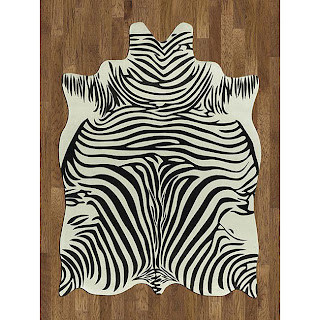
the zebra rug ties in the white cabinetry with the dark accents and, lucky for us, inexpensive options abound.
zebra hide rug, $83 for 5' x 7'
how about this offering from overstock? i like the irregular shape but it's the price that really caught my attention. $83 for a 5' x 7' rug? out of this world!
the zebra print doesn't stop there. more art, this time casually propped against a wall, looks effortless but makes a big impact.
mike prowles print, $45+ depending on size
another art.com find to the rescue!
household essentials bamboo storage boxes, $55 for two
prop your print on a decorative box to continue the naturally elegant look. i love the feel of these boxes from target, even if they're not a spot on replica.
don't forget a silver tray and various objets d'art to top it off.
it's hard to tell from this photograph whether this lamp is clear or metallic so i've gone ahead and found versions of both.
replace the boring white with a black shade to duplicate the dramatic look of the vignette above. stack a couple of design books and a few more trinkets and your room will be as luxe as the one johansson so beautifully captured.
what do you all think of this space? i had no idea a black couch, black accent wall, and dark floors could look so radiant. the accessories — zebra everything, natural wood, a fur throw, etc. — keep the space fun and casually elegant. and that's never a bad way to start a new week, right?


