>

one of my favorites!

i discovered this incredible space by kara mann on desire to inspire ages ago and it instantly became one of my all-time favorite interiors. the designer's website states that "KMD reflects a luxury lifestyle with clean lines, warm layers and timeless designs." i think you'll see what she means in this home. i hope you'll enjoy it as much as i do!
there are two things i noticed right off the bat: the seamless transition between inside and out (and we know i love a good outdoor space!) and the flawless layout of the furniture within the room. two couches positioned across from one another allow for unrestricted traffic flow throughout the center of the room, while the absence of side tables between the oversized armchairs as well as the two chairs by the fireplace continues this unpretentious vibe.
another shot of the beautiful exposed ceiling beams and — gasp — that waterfront view. the objets d'art on the coffee table are simple and natural to let the view do the talking.
i love the idea of hanging lightweight curtains to soften the transition between indoor and outdoor spaces. you'd have to live in the right climate, of course, but i think they reinstate the casual come-and-go-as-you-please feel of the entire space. and how perfect are the suzani pillows?
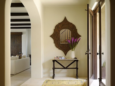
a glimpse of the room from the foyer of the home. isn't that mirror awesome? i love the big wide doorways.
the outdoor dining area. i love the chairs, which appear to be slipcovered, and the way they mimic the furniture used in the interior portion of the space.
a heavy table anchors this informal dining room, which makes me think that the homeowners really do spend a ton of time out here. then again, why wouldn't they?
now that's a view i could get used to. how about you?

small space, big impact

i love the idea of using a small space like a bathroom or a closet to go all out with color and wallpaper that you might not dare try in a more prominent part of your home. here are a few of my favorite examples of bathrooms where this dramatic approach pays off:
one of my favorite designers experiments with a wild pink mirror and orange subway tile. the paisley shower curtain isn't quite my taste, but don't you love the color scheme?
happy wallpaper and cool art make this bathroom a sight to behold.

this bathroom is a prime example of risks with color paying off big-time. blue tile, black stone inlay, red/pink trimmed curtains, amazing white cabinetry, a little leopard print vanity chair... and somehow it just works.
big, bold, and blue. plus a mirrored vanity. i could make this work!

i thought wrong

happy monday, my darling readers! how was your weekend? london has been lovely and, as always, the street style here has not disappointed! while we're on the subject of style (aren't we always?) i'd like your opinion on the following trend. you see, i thought oxford shoes were dreary and masculine, but then i saw these lovely ladies rocking the look:
and now... i think i thought wrong.

what's your take?